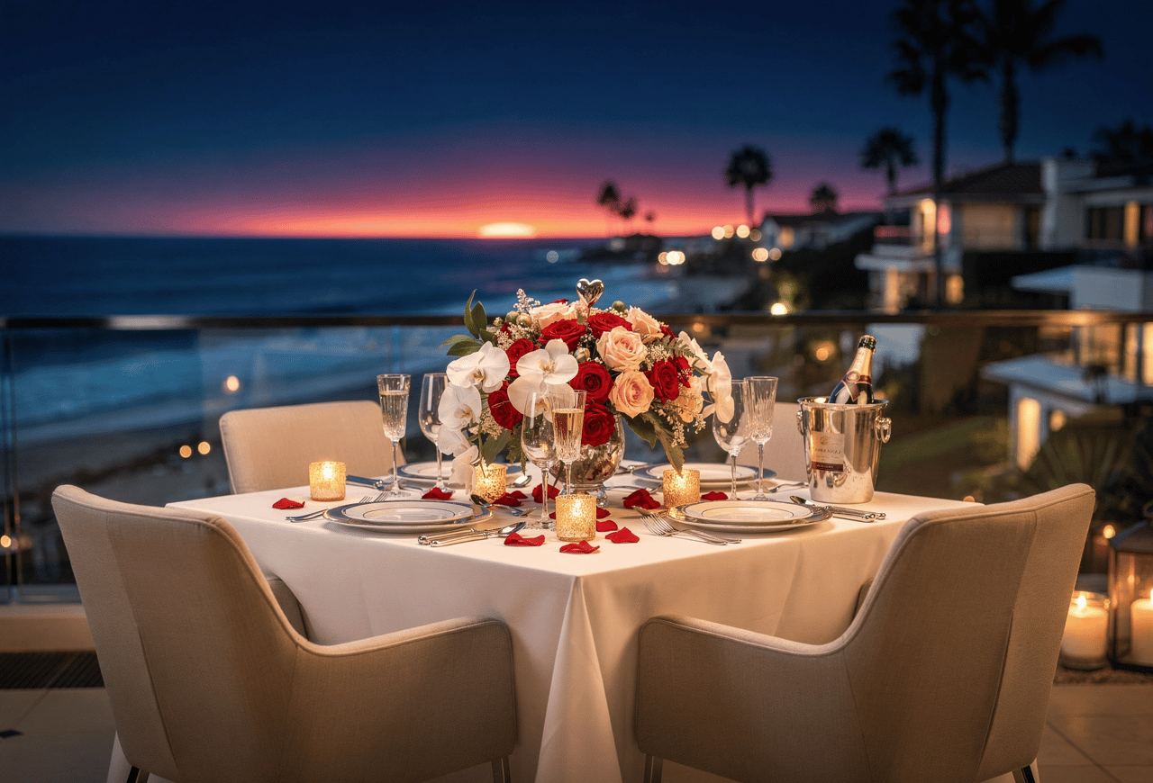
Color is one of the easiest ways to change the feel of a home, yet it is also one of the hardest choices to make. A shade that looks perfect on a paint chip can feel completely different once it is on every wall. In a coastal market like Newport Beach, where light, views, and indoor-outdoor living play such a big role, understanding how to choose paint colors for your home helps every room feel intentional rather than random.
Start With the Light in Each Room
Light is the first and most important factor in any color decision. The same paint can look crisp and bright in one room and flat or muddy in another. Before opening a fan deck, it's helpful to observe how light moves through the space during the day.
In Newport Beach, many homes enjoy strong natural light, but the quality of that light changes depending on the direction. Rooms that face the ocean or receive cooler daylight often make cooler colors look even sharper, while warm neutrals can balance that effect. Spaces that receive afternoon sun may benefit from softer tones that do not feel overwhelming at peak brightness. Overhead lighting, lamps, and under-cabinet fixtures also matter, since color needs to work well after sunset as well as during the day.
In Newport Beach, many homes enjoy strong natural light, but the quality of that light changes depending on the direction. Rooms that face the ocean or receive cooler daylight often make cooler colors look even sharper, while warm neutrals can balance that effect. Spaces that receive afternoon sun may benefit from softer tones that do not feel overwhelming at peak brightness. Overhead lighting, lamps, and under-cabinet fixtures also matter, since color needs to work well after sunset as well as during the day.
Understand Color Temperature and Undertones
All colors have a temperature and an undertone, even whites and grays. Warm tones lean toward yellow, red, or brown, while cool tones lean toward blue, green, or violet. Undertones are the subtle hints that only become apparent when the paint is next to other materials in the room.
In practice, this means a white that looks neutral on its own might turn slightly yellow next to cool marble or slightly blue against warm tile. If you are a homeowner deciding how to choose paint colors for your home, you should place samples near flooring, countertops, tile, and trim rather than viewing them in isolation. Matching or intentionally contrasting undertones creates a more polished and cohesive look.
In practice, this means a white that looks neutral on its own might turn slightly yellow next to cool marble or slightly blue against warm tile. If you are a homeowner deciding how to choose paint colors for your home, you should place samples near flooring, countertops, tile, and trim rather than viewing them in isolation. Matching or intentionally contrasting undertones creates a more polished and cohesive look.
Match Color to Room Function and Mood
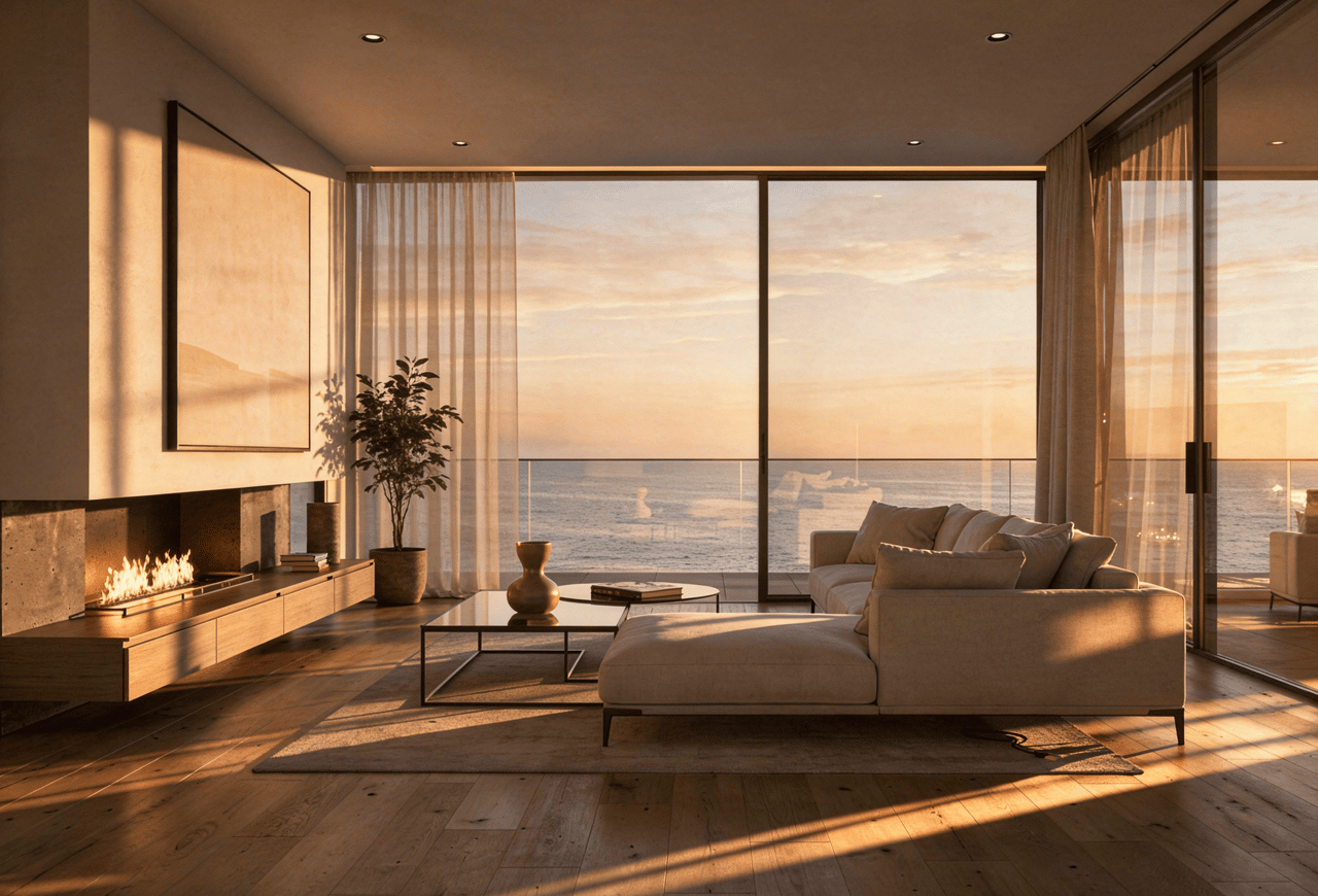
Every room has a purpose, and color can either support or work against that purpose. Living rooms and family rooms in Newport Beach often function as gathering spaces that open to patios or decks. Soft neutrals with gentle warmth keep these areas inviting and flexible for different furniture and decor.
Bedrooms usually benefit from quieter palettes. Muted blues, greens, and soft taupes provide a restful backdrop, supporting the calm atmosphere and enhancing the beauty of textiles and art. Kitchens and bathrooms often look best with clean, balanced colors that feel fresh without feeling harsh. In home offices, slightly deeper tones can help reduce eye strain and create a focused atmosphere without making the room feel closed in.
Bedrooms usually benefit from quieter palettes. Muted blues, greens, and soft taupes provide a restful backdrop, supporting the calm atmosphere and enhancing the beauty of textiles and art. Kitchens and bathrooms often look best with clean, balanced colors that feel fresh without feeling harsh. In home offices, slightly deeper tones can help reduce eye strain and create a focused atmosphere without making the room feel closed in.
Create Flow Throughout the Home
Homes, especially those with open layouts, require a sense of connection from one room to another. That does not mean every wall must be the same shade, but it does mean that transitions should feel natural. A common approach is to choose one main neutral for the primary living spaces, then shift to related tones or deeper versions of that color in secondary rooms.
Hallways, stairwells, and entryways help link spaces together. Keeping these areas simple and consistent allows accent colors in bedrooms, studies, or dining rooms to stand out without feeling disconnected. In Newport Beach, where sightlines often extend from front entry to outdoor living spaces, a thoughtful palette can make the whole home feel calm and continuous.
Hallways, stairwells, and entryways help link spaces together. Keeping these areas simple and consistent allows accent colors in bedrooms, studies, or dining rooms to stand out without feeling disconnected. In Newport Beach, where sightlines often extend from front entry to outdoor living spaces, a thoughtful palette can make the whole home feel calm and continuous.
Work With What You Already Have
Paint does not exist in a vacuum. Fixed elements such as flooring, countertops, fireplaces, tile, and cabinetry should guide color decisions. For example, a room with warm wood floors and earth-toned stone will usually feel more harmonious with paints that have warm undertones, even if the overall palette is light and neutral. A space with cool tile and stainless finishes may work better with grays and whites that lean cooler.
It is often easier and more cost-effective to adjust paint than to change permanent finishes. Using these existing elements as a starting point ensures the final result feels cohesive rather than forced.
It is often easier and more cost-effective to adjust paint than to change permanent finishes. Using these existing elements as a starting point ensures the final result feels cohesive rather than forced.
Balance Neutrals and Accent Colors
Neutrals create flexibility, but a home made entirely of one shade can feel flat. Accent colors add depth and personality when used thoughtfully. A feature wall behind a bed, a deeper tone on cabinetry, or a richer color in a powder room can all add interest without overwhelming the overall design.
The key is restraint. A few well-chosen accents are more effective than a different bold color in every room. In many Newport Beach homes, soft, coastal-inspired tones are featured in textiles, art, and accessories, while walls remain neutral enough to appeal to both current residents and potential buyers.
The key is restraint. A few well-chosen accents are more effective than a different bold color in every room. In many Newport Beach homes, soft, coastal-inspired tones are featured in textiles, art, and accessories, while walls remain neutral enough to appeal to both current residents and potential buyers.
Test Before You Commit
Even with careful planning, paint choices should always be tested in the actual space where they will be used. Small chips are useful for narrowing options, but larger samples provide a more accurate picture. Painting sample swatches on multiple walls allows homeowners to see how the color changes with light and shadow throughout the day.
When deciding how to choose paint colors for your home, it helps to live with these samples for a few days. Viewing them in morning light, afternoon brightness, and evening artificial light gives a fuller understanding of how the color will behave in real life. Taking photos at different times can also help with comparison.
When deciding how to choose paint colors for your home, it helps to live with these samples for a few days. Viewing them in morning light, afternoon brightness, and evening artificial light gives a fuller understanding of how the color will behave in real life. Taking photos at different times can also help with comparison.
When in Doubt, Keep It Simple and Layer
If the choices begin to feel overwhelming, simplicity is often the best path forward. A restrained palette of a few well-chosen neutrals, paired with thoughtful accents in decor, can be both beautiful and practical. Once the foundation is set, it is easier to experiment with color in smaller doses rather than repainting entire rooms. Layering texture, pattern, and materials on top of a cohesive paint scheme keeps spaces interesting and comfortable without constant redecoration.
Turning Color Decisions Into Market-Ready Spaces in Newport Beach
Color has a direct impact on how a home feels in person and how it appears in photos, both of which matter in a coastal market where buyers are discerning. The File Group helps Newport Beach homeowners and sellers consider palette choices with an eye toward both daily enjoyment and long-term value, from subtle refreshes to full-home updates. For guidance on aligning design choices with your real estate goals in Newport Beach, CA, contact The File Group today.
*Header image courtesy of Unsplash
*Header image courtesy of Unsplash